


Build A StackOverflow Dashboard (Part 2): Crafting BigQuery Views and Superset Charts


In part 1 of this blog series, we learned:
- how BigQuery charges for storage and compute
- about public datasets in BigQuery
- how to connect Superset to BigQuery
In this post, we'll walk through:
- how to prep the StackOverflow dataset for visualization
- how to create simple charts using just the
questionstable
Preparing The Dataset
The full StackOverflow dataset is updated regularly and is quite large. The questions table alone is hundreds of gigabytes, which makes it very easy to run into the 1 terabyte quota to stay in the free tier.
To reduce the BigQuery compute we're using, we can create a filtered view of the questions table and use this view of the data to explore charts and create dashboards in Superset.
- Fire up the BigQuery console, expand the
bigquery-public-dataworkspace, and scroll down to thestackoverflowdataset.

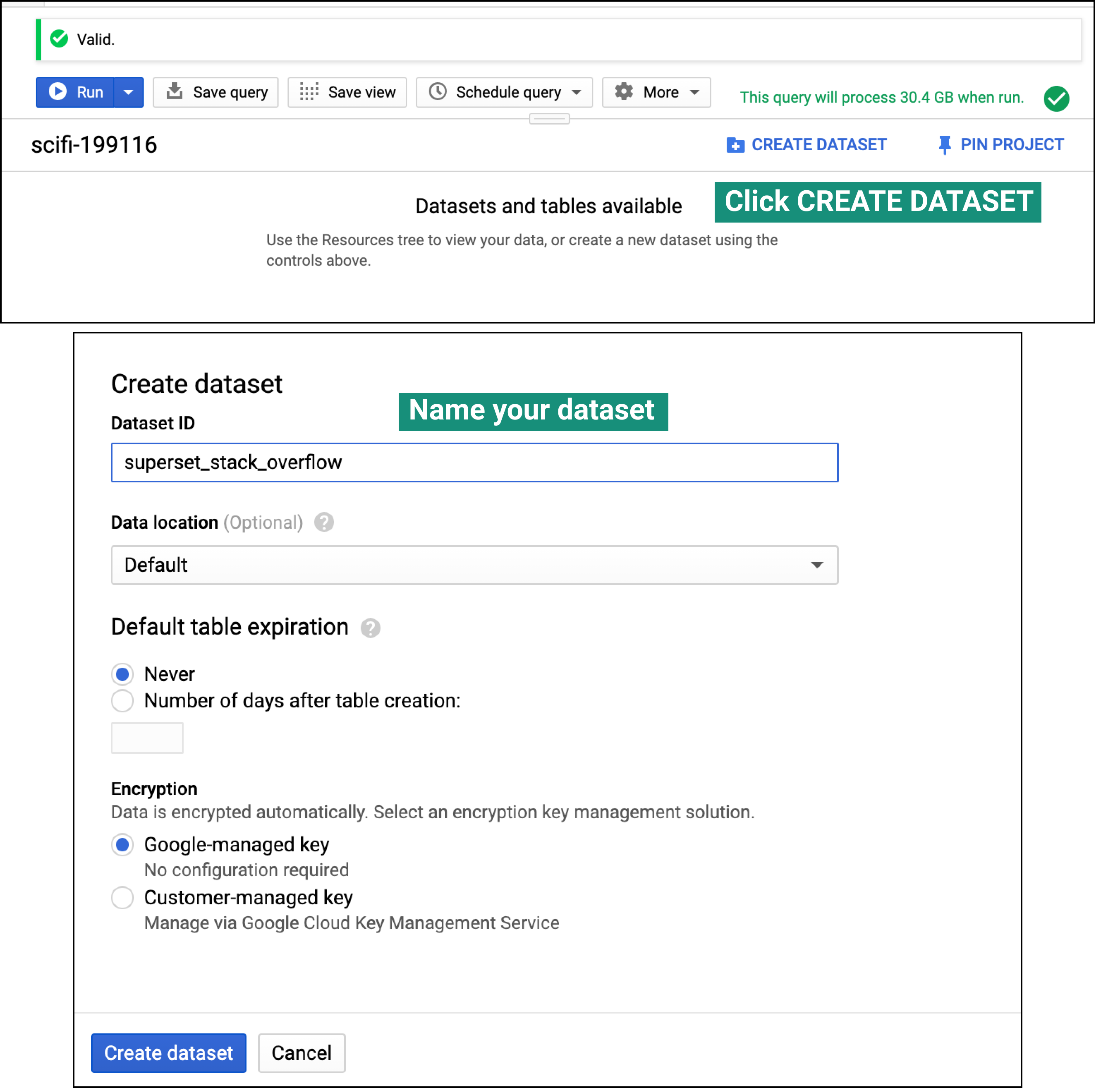
- Before we can save the query as a view, we need to create a dataset in BigQuery.
-
Spend some time using the dataset preview and metadata to get familiar with the
questionstable. Write and run the query that will filter this table down to the tags you care about. Note that many questions on StackOverflow are tagged using multiple tags. At Preset, we care about monitoring questions on Superset so we're going to run the following query to focus on questions tagged with either / bothsupersetandapache-superset:SELECT tags, creation_date, answer_count, comment_count, title, body FROM `bigquery-public-data.stackoverflow.posts_questions` WHERE REGEXP_CONTAINS(tags, 'superset') or REGEXP_CONTAINS(tags, 'apache-superset') ORDER BY creation_date desc -
Click Save View, select the dataset you just created in step 2, name your view, and click Save.

You can preview the view you created in Superset by:

- navigating to SQL Lab
- changing the Database to your BigQuery connection you added in part 1
- changing the Schema to the dataset you created earlier in this post (BigQuery datasets map to schemas in Superset)
- Navigate to Data > Datasets and you should see the view you created there as a dataset.

- If this view isn't listed as a dataset, it's possible you don't have the right permissions setup in BigQuery. The alternative approach to creating charts from a public BigQuery dataset is to query it from SQL Lab and then trigger the Explore workflow from the query.

To end this section, let's add 2 **Calculated Columns** to create new columns (by transforming existing columns in the table) for better visualization. To create these, click the dropdown in the **Datasource** field.
- The
answer_countcolumn contains integer values that correspond to the number of answers a question has. Let's bin the values and transform this column into more of a binary classification one.

- Part of the usefulness of a StackOverflow dashboard is to be able to identify interesting questions and then be able to jump straight to those questions. We can create a new column that represents HTML links to StackOverflow questions. A link to a StackOverflow questions consists of just the base URL "https://stackoverflow.com" along with the
idfor that question (e.g. "/23424"). We can use string concatenation (CONCAT()) along with values from theidandtitlecolumns.

Creating Charts Visualizing Question Trends
We're now ready to start creating charts in Superset! After the last section, you should be in the Explore view in Superset, with the filtered view of the StackOverflow dataset set as the Datasource.
The workflow for selecting charts in Superset and publishing them to a dashboard is incredibly fast, enabling us to create our dashboard in just a few minutes. This is now your canvas; feel free to modify the charts we suggested and apply your own creativity.
- Big Number chart. Let's start nice and simple! Create a Big Number chart that showcases the total number of questions asked. Set the Metric field to
count, add text after the big number by editing the Subheader field if you'd like, then click Save. Make sure to specify that you want a new dashboard. - Big Number with Trendline charts. Create the following charts by setting the Metric to
countand playing with different Time Grain and Time Range values.

- Pie chart. With our new
has_answerscolumn, we can create a pie chart that lets us glance at the proportion of questions that remain completely unanswered. To create this chart, set the Metric field tocountand set the Group by field tohas_answers.

- Table. This table will help us understand the most popular questions, by view and answer counts. Set the Group by field to
question_url(one of the calculated columns we created earlier), the Metrics field to bothSUM(view_count)andSUM(answer_count)), and finally set the Row Limit field to10.

- Box Plot. This chart will help us understand the distribution of views for both unanswered and answered questions.

-
Markdown component with logo. Finally, let's add the StackOverflow logo to tie all of the charts together aesthetically. Open the dashboard you've been working on, switch to Edit Mode, and drag in the Markdown component to the dashboard. Then, edit the Markdown component and replace the text with:
<iframe src="https://cdn.sstatic.net/Sites/stackoverflow/company/Img/logos/so/so-logo.svg?v=a010291124bf" class="iframe" scrolling="no"></iframe> -
Finally, let's stack the Big Number chart with the Markdown component containing the StackOverflow logo into a Column in the dashboard. We cover how to do just this in our Slack dashboard blog post.
-
Re-arrange the dashboard components to match a layout similar to:

This is a great start! In part 3, we'll dive deeper into:
- joining multiple tables from the StackOverflow dataset
- expanding the dashboard to have multiple tabs for multiple use cases
- make our dashboard more dynamic, using filters
See you in part 3!
